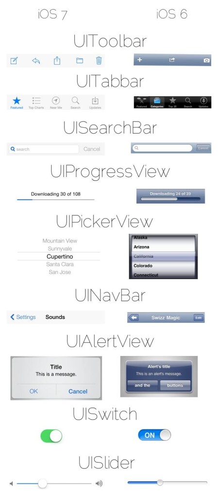
iOS developer MPow recently tweeted an interesting comparison image of iOS 6′s UI views versus the new elements found in iOS 7. It’s a great way to gain a high level overview on the scope of the visual changes occurring with iOS.
The image compares common elements like the toolbar, tabbar, searchbar, switches, sliders, and much more. It’s a great way to appreciate some of the widely seen visual changes happening with iOS. If you happen to be a developer, or are at least interested in what it takes to create an app on iOS, you’ll especially appreciate this. Take a look inside for the full image.
As we’ve already come to appreciate, iOS 7 is a huge departure from all that we’ve come to know over the last 6 years. But this breakdown helps us to understand just how pervasive the changes are on a more intimate scale.


0 comments:
Post a Comment